P4: Create the media components to be used in the planned campaign
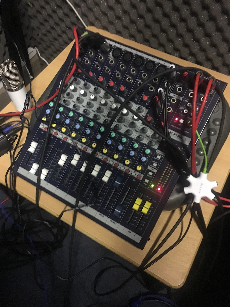
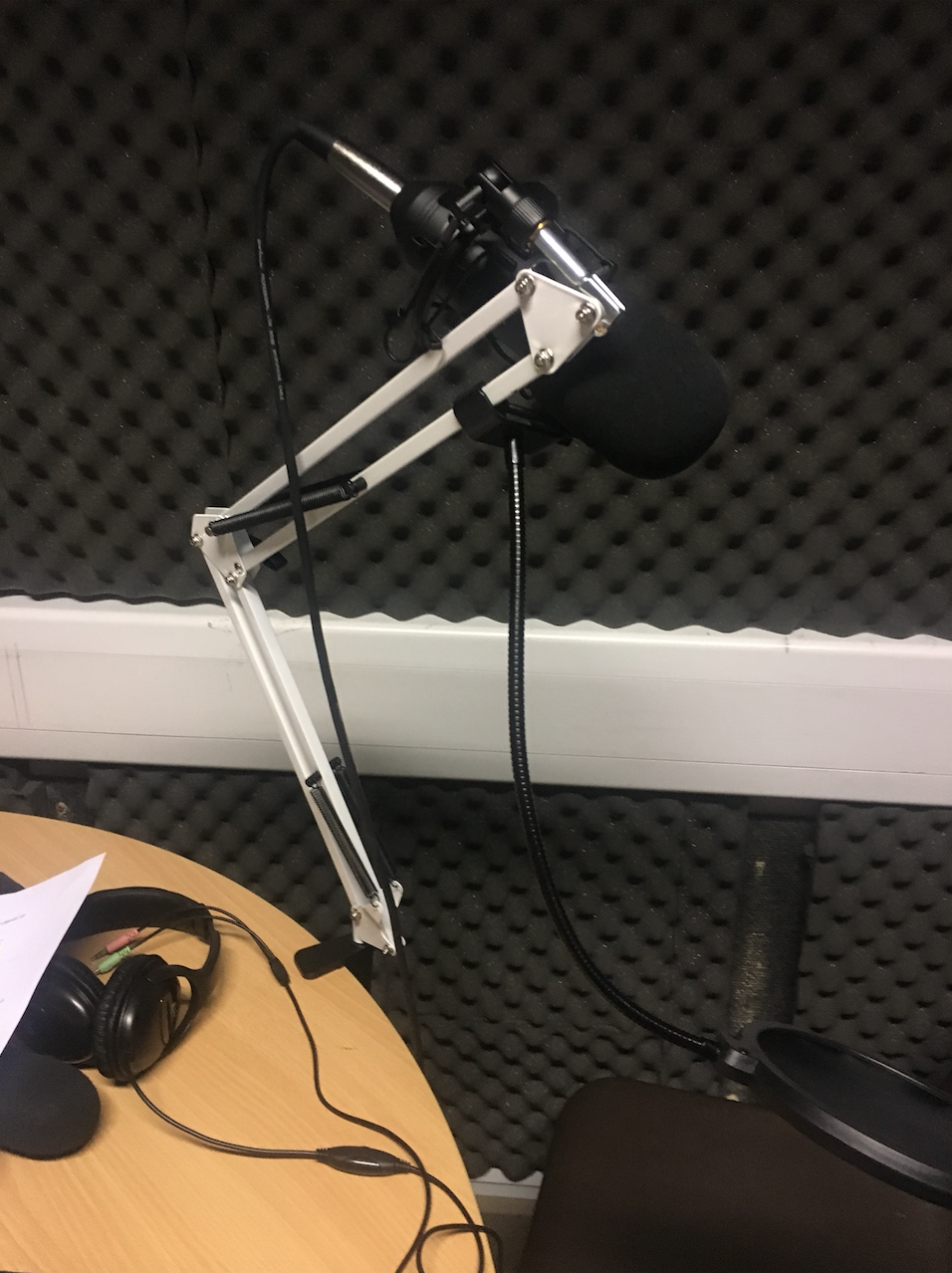
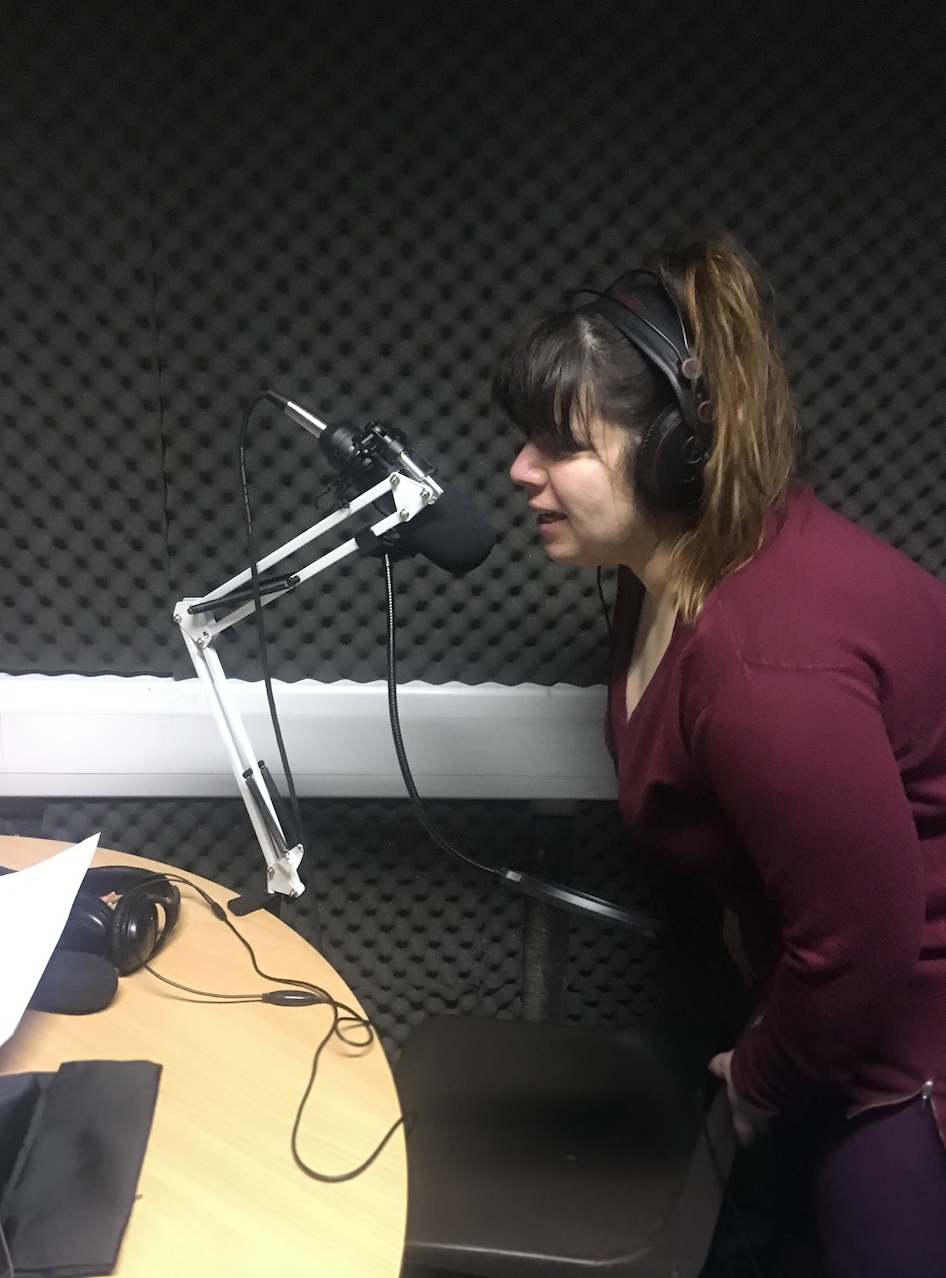
On set recording the radio ad
|
|
|
|
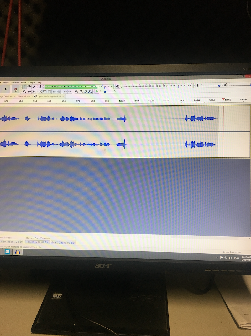
Editing the radio ad
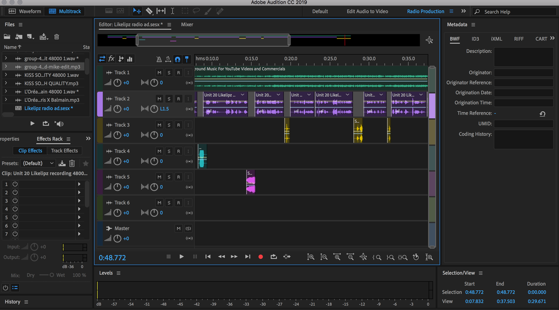
Radio ad
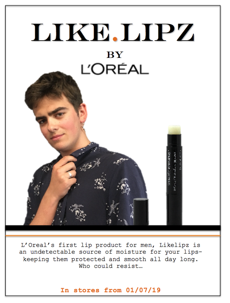
Flyer
M3: Explain how the created media components comply with the codes and conventions of the media sectors
Looking at other products on the market that are similar to those I have created, has allowed me to easily identify the codes and conventions that professionals would typically use when it comes to an advertising campaign. The first example of this that I have replicated is the integral use of photo imagery in print campaigns. Having high quality images of both models, and the product itself is a very direct way to grab the audience attention. Not only does it allow the consumer to absorb information more directly, but is also just more aesthetically pleasing. These reasons are why I chose the focal point of my flyer to be images. Another thing I noticed whilst looking at similar campaigns is that male targeted ads are quite monochrome with one feature colour. I chose to focus more on L'Oreal products in particular as this is the brand the product is for. From the research I conducted it was apparent that on their male oriented products, orange is a colour they tend to stick with for packaging and advertising, therefore I echoed this in my print flyer.
From my research I also came to understand that brand identity is really important for advertising campaigns. For example slogans and tag-lines are something that make brands instantly identifiable to the consumer. The same goes for brand logos, colouring, and overall design of ads. The reason this is important in terms of marketing, is that customers are much more likely to consume a product that comes from a trusted and well known brand- something that they are familiar with as opposed to something that they are not. This is why I focused on brand identity whilst creating both my print flyer and radio ad for the product.
I noticed that when it comes to radio ads, they are very short and to the point. Therefore when scripting my radio ad, I made sure to include all of the integral parts of a typical radio ad, whilst also keeping it concise. The reason for this is that radio in particular is something people listen to whilst they are doing something else like driving for example. Therefore, it is important to grab the consumers attention for the few seconds that you have. I came to the conclusion that a lot of companies use interesting sound effects, catchy music, and an appealing narrator to do so. Because of this, my radio ad included all of the aspects previously mentioned.
D2: Demonstrate how the technical and aesthetic properties of the media components meet the client brief.
The brief for this product states that the company requires both a radio and print advert for this campaign, which I believe I have successfully created. I made it very clear in both ads that the product is for men, has spf 20, protects and moisturises the lip, tastes of passion fruit and cherry, and comes in a sleek black case- which is all key information that the brand provided me with. I made sure to include this information because not only is it important for the company to be crystal clear about what they're selling, but also for the consumer to know exactly what they are buying. It was also made clear in the brief that L'Oreal see the Likelipz product as a potential gateway to creating more male cosmetics. Because of this, I felt it very important that creates a campaign that excites men about the product, whilst also easing them in to a still very female dominated market. I did this by making the advertisements rather minimalist, as to not be overwhelming, but also sexy, so that the ads entice men to interact and consume the product. I did this by using a male model for the print flyer, with a very crisp simple layout and only one feature colour, keeping it sleek and sophisticated. The radio ad had a sultry female narrator with a few fun sound effects but nothing crazy loud or cluttered.
The font and imagery used in the print advert links very well to the purpose and aim of the product. It is minimalist, sleek and sophisticated, much like the product itself. Echoing the fact that you can use this product without anyone even being aware, as it only enhances what is already there. The campaign as a whole is more stereotypically masculine than other ads out there, which again links perfectly to the product as it allows L'Oreal to masculinise a cosmetic product. Through the research I conducted previously it became apparent that my target audience don't respond well to busy, in your face ads. Therefore I stuck to simple fonts, a limited colour palette, minimalist layout, and everyday lingo. This as a result makes the product much more appealing to the consumer as it is not off putting and doesn't scream commercialism in their faces. It is much more likely for my audience to engage if they enticed by a product than grabbed by one. Professionalism and brand identity is something I was aware to give a lot of attention when creating these ads. I made sure first of all that the ads looked and sounded professional so that the audiences trusted them. Anything less than professional just reflects badly on the product and so was not acceptable in my eyes. Secondly, reinforcing brand logos, slogans and overall characteristics is also crucial, as consumers like a brand they know and trust and so ultimately works in my favour marketing wise.
The font and imagery used in the print advert links very well to the purpose and aim of the product. It is minimalist, sleek and sophisticated, much like the product itself. Echoing the fact that you can use this product without anyone even being aware, as it only enhances what is already there. The campaign as a whole is more stereotypically masculine than other ads out there, which again links perfectly to the product as it allows L'Oreal to masculinise a cosmetic product. Through the research I conducted previously it became apparent that my target audience don't respond well to busy, in your face ads. Therefore I stuck to simple fonts, a limited colour palette, minimalist layout, and everyday lingo. This as a result makes the product much more appealing to the consumer as it is not off putting and doesn't scream commercialism in their faces. It is much more likely for my audience to engage if they enticed by a product than grabbed by one. Professionalism and brand identity is something I was aware to give a lot of attention when creating these ads. I made sure first of all that the ads looked and sounded professional so that the audiences trusted them. Anything less than professional just reflects badly on the product and so was not acceptable in my eyes. Secondly, reinforcing brand logos, slogans and overall characteristics is also crucial, as consumers like a brand they know and trust and so ultimately works in my favour marketing wise.
